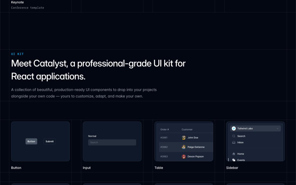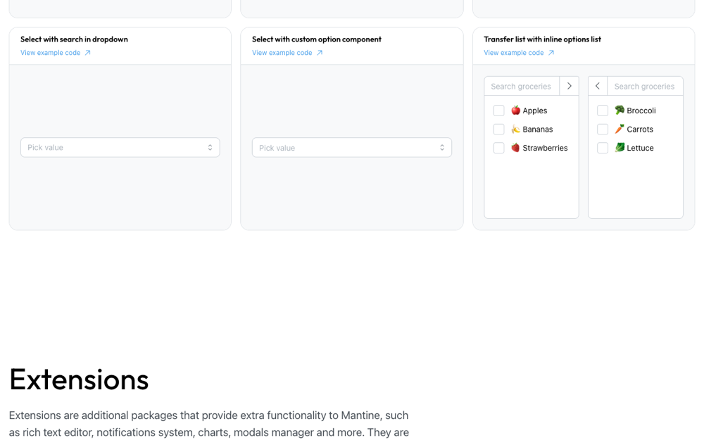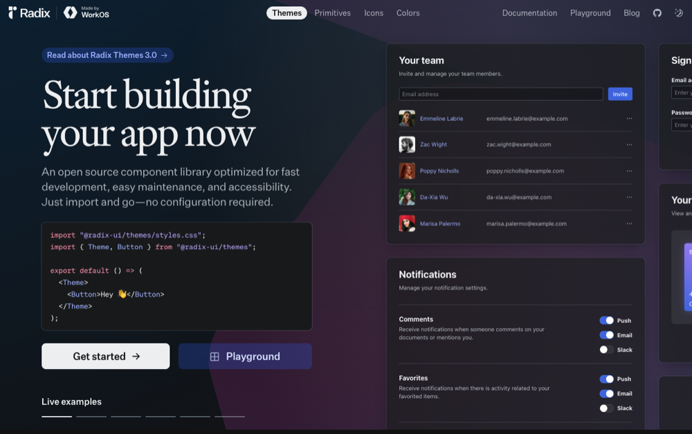
shadcn/ui
Composable copy-paste components for Tailwind apps.
Open website →
The fastest path from “make me a dashboard” to a usable interface brief. Pick your AI coding tool, product type, stack, and visual reference; UI-Kits.com turns the choice into a copy-paste prompt with component asks and follow-ups.
Make the prompt builder the first stop before Cursor, Claude Code, v0, Lovable, Bolt, Replit, or Windsurf starts generating screens.
Click the textarea to select all, then copy. Or use the button below.
A dense SaaS dashboard shell with sidebar navigation, KPI cards, trend charts, a customer table, and explicit empty/loading/error state hooks.
export function DashboardOverview() {
  return (
    <main className="grid min-h-screen lg:grid-cols-[260px_1fr]">
      <SidebarNav sections={['Overview', 'Customers', 'Usage', 'Billing']} />
      <section className="space-y-6 p-6">
        <DashboardHeader title="Revenue operations" action="Invite teammate" />
        <div className="grid gap-4 md:grid-cols-4">
          {metrics.map((metric) => <MetricCard key={metric.label} metric={metric} />)}
        </div>
        <div className="grid gap-4 xl:grid-cols-[1.4fr_1fr]">
          <RevenueChart state="loaded" />
          <ActivationChecklist state="empty-ready" />
        </div>
        <CustomerTable state="loaded" />
      </section>
    </main>
  )
}
Source: Manually curated representative Cursor-style output for the prompt builder default preset.
shadcn/ui — matches your chosen stack and works well with CURSOR.
Sidebar navigation with icons (Dashboard, Users, Analytics, Settings, Billing)
Top header with breadcrumbs, search, notifications, user avatar menu
Stat cards row (4 KPIs with trend indicators)
Primary chart panel with tabs for ranges
Recent activity table with pagination and row actions
Empty, loading, and error states for every data panel
"Add empty, loading, and error states for every data-driven view."
"Audit color, spacing, and typography tokens for consistency across screens."
"Make every page responsive down to 360px and verify on a phone-sized viewport."
"Add accessible labels, focus styles, and keyboard navigation to all interactive elements."
"Wire stat cards and charts to mocked data with realistic ranges and units."
"Use Cursor's multi-file edit mode to apply the changes atomically."
Once the AI has produced a first pass, compare the result against the generated component list, follow-up prompts, and the visual reference before launch.